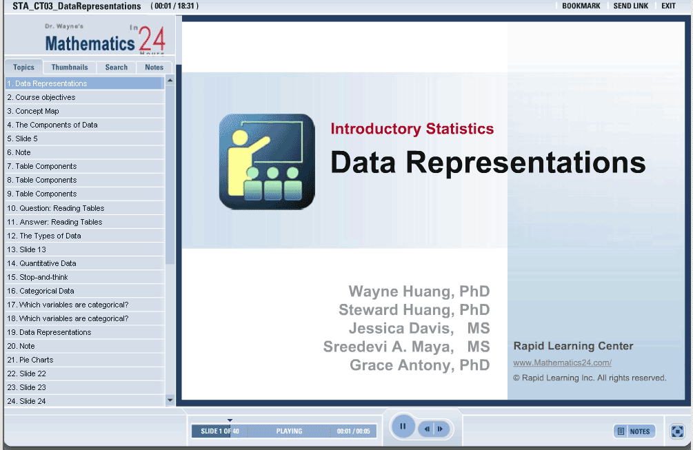
Data Representations
| Topic Review on "Title": |
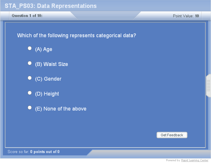
- Quantitative Data – involves variables that can be counted and are usually measured in units
- Categorical Data – involves variables that are recorded as numbers but represent uncountable objects
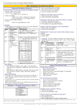
- Pie charts: indicate the part of the whole that each individual occupies – let’s examine the data from our table.
- Bar charts have an x and y axis. The x-axis indicates the individuals of the table. The y-axis indicates the variables of the table. The height of the bar indicates the frequency in which a variable occurs.
- Histograms are the most common graphs of distributions with one quantitative variable.
- Stem and Leaf Plots are ideal for small data sets.
|
| Rapid Study Kit for "Title": |
| Flash Movie |
Flash Game |
Flash Card |
| Core Concept Tutorial |
Problem Solving Drill |
Review Cheat Sheet |
 |
 |
 |
|
| "Title" Tutorial Summary : |
The objectives of this tutorial include: understanding the makeup of data. This implies knowing how to distinguish between categorical and quantitative data and learn how to use frequency tables to describe categorical data.
In addition, we will also explore graphing tools that aid in describing data. So after finishing this tutorial, you will be able to present your data in a vivid way so that we may draw important information from it.
|
| Tutorial Features: |
Specific Tutorial Features:
- Individuals make up the rows of a table
- Variables make up the columns of a table.
- Categorical data can not be averaged.
- Quantitative data is usually measured in units.
Series Features:
- Concept map showing inter-connections of new concepts in this tutorial and those previously introduced.
- Definition slides introduce terms as they are needed.
- Visual representation of concepts
- Animated examples—worked out step by step
- A concise summary is given at the conclusion of the tutorial.
|
| "Title" Topic List: |
- Tables
- Quantitative data
- Qualitative data (Categorical data)
- Data representation (pie chart, bar charts, histograms, stem and leaf plots)
|
See all 24 lessons in Introductory Statistics, including concept tutorials, problem drills and cheat sheets:
Teach Yourself Introductory Statistics Visually in 24 Hours |